Michael Johnson
Artist Profile celebrates the masterful oeuvre of Australian abstractionist painter, Michael Johnson. In this exclusive essay featured in Issue 34, we invited writer Anna Johnson to describe her time in her father's studio, in what was a 'forty year conversation about art'. The artist's new paintings have taken a radical development amid the plays with time and spacial awareness to provide fresh sensory experiences.


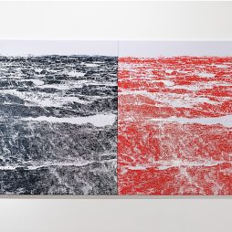
The first painting my father, Michael Johnson, looked at closely as a child was an intense nocturnal work by Albert Pinkham Ryder called ‘Toilers of the Sea’. In art historical terms, Ryder inspired the early Modernists but was attributed with a naive crudity. Some considered him a cult Romantic landscape painter. Yet through Johnson’s lifetime this small oil painting from the late 19th century moved with him, mapping an evolution of experience, from night fishing in Sirius Cove, to painting minimal shaped canvases in nocturnal hues, through a long passage of gestural work, right up to a painting finished in the first lunar month of this year, ‘Helix’ (2016).
The force of Ryder’s painting, glowing with a heavy moon, advancing with great curves of paint and receding into the darkness of its own palette, inspired in Johnson two very strong preoccupations. The first was the dynamic relationship between colour and form. And the second was the power of pure abstraction to transmute elemental realities, to put the sea or the night into a painting without depicting it literally.
These ideas sustain and connect a relentless, consistent experimentation with colour and are possibly the only narrative he will ever offer up. His works change but there is a larger tidal force beneath each wave.
Our first real conversation about painting began with a question. It came at seven when I asked him to paint a circle. “Why,” I added, “is everything square?” In 1973 many of Michael Johnson’s abstract paintings appeared resolutely flat, spare for the feature of a large confrontational central block and scattered dis-moored bars. He was generating large-scale pastel drawings and paintings of subtle tonal gradation created with an airbrush compressor. The surfaces were lyrical but their structure was tight, wedged into the right angles of scaffolding or the jagged leaps of the modern dancers he knew. We lived in Manhattan, the most vertical of cities, and the canvas on the studio floor was covered in long rods of wood that were pushed into place like poles in a moving river.
Staring at a large unfinished work, traced in charcoal on raw canvas, the rigidity of the shapes made me yearn for a big hand-drawn egg, a shaking curve, the sun. “Look a bit harder,” came his reply, “every line you see on a diagonal is part of a circle, you don’t need to see the finished arc to feel its energy.” OK. This small lesson in the geometric underpinning of a composition was a short education into the inbuilt contradictions of abstract painting. Nothing can be entirely gestural or entirely planned. A sustained picture is always the sum of both parts.
The temptation to see abstract art as a terrain without a map or, conversely, simply the map alone, misses many nuances. In Johnson’s career extremities have been reached, but very slowly and with meditative rigour. The connective tissue has always been colour, a palette devoid of secondary colours or tonality.
Anyone educated at an Australian art school in the late 1950s would also be reaching for pure colour. Marching a mass exodus from gloomy sepia, the abstract generation of the early 60s were in chromatic revolt. In this regard colour in his work might have begun as a stance before it became a quest. His distaste for tonal spectrums extended to the monochrome. “A white painting?” he often quipped, “You’ve got to be careful of too much good taste. Beauty and good taste are not the same thing, you don’t want to be an object of décor.” Through years of richly hued work the question of the white painting came up many times. Walking through a Malevich retrospective, Johnson went as close he could to a grimy looking, all-white composition: “Look at the tiny smudges. Look at the brushstrokes. See the human hand inside the void? Everyone thinks that minimalism is anti-sensual, mechanical, divorced from the body but this work is handmade, Mondrian is handmade … abstraction distils, it doesn’t just divorce.”
Johnson can be an artist who argues with his own tenets across simultaneous mediums. In his studio there has always been at least five major disciplines at play: the structural drawings (rough as guts sketches scrawled straight on the wall or on scraps of paper), ink and watercolour calligraphy studies, crayon and gouache works on paper, small sculptures and found objects and then … the main paintings. All this and the random pages torn from science and nature magazines, alluding to animal fur, comets and frog spawn.
Treading between the oil tubes, I didn’t always see the changes coming. Subtly but distinctly, the work seemed to shift gears in cycles of decades, almost in the pattern of a figure eight spread across 50 years. Johnson began with small anthropomorphic landscapes in his late teens, he then refined to minimal geometric abstraction throughout the 1960s and then, gradually, forged a language of lyrical, gestural work dense in both line and paint. By the mid 2000s the density of the surface in his paintings began to clear. These hinted at the major change to come. It was a transformation that culminated in his large mural ‘Oceania high low’ which won the Wynne Prize in 2014.
Before the ‘Oceania high low’ work reached the public eye it was Johnson’s big experiment, filling his modest studio to capacity and, stylistically, providing something of an elephant in the room. In terms of palette, surface and execution this was a departure on a grand scale. The decision to place it in a public arena was also fraught (having never entered an art prize in his career) yet, ultimately, timely. While he had been busy going back to his roots in terms of very streamlined composition, a new generation of abstract painters were also embracing colourist minimalism. Perhaps some of them were looking to the seminal exhibition The Field (1968) which was such a strong part of Johnson’s youthful manifesto. And perhaps it’s just a seasonal shift in mood, the inevitable cycle between excess and restraint.
To those who missed a few solo shows, the shift from “soft” to “hard” might have resembled night and day. But the course is closer to a continuum. “The source of ‘Oceania’ is not obvious at all … I had collected some images of cormorants diving and breaking the skin of the water to catch fish. I interpreted the movement of this by creating calligraphy drawings with large, thick brushes then making a collage from the drawings, cutting into them to exaggerate the space between the lines and the void.” This said, the leap from drawn line to flat plane seems a long one. Where does he sit with the constraints of change? “I don’t miss the touch or the gesture because the lineal rhythm of geometry is like a dance. Instead of a contour line drawing there is a planar tension between line and surface. Once upon a time people said that Pollock was just using line alone. I said NO, line has two contours and a plane in between. The line comes back on itself.”
This idea is true of an early painting like ‘Sofala’ (1965) where a line that skirts the paintings edge swerves left and swoops in on a convex arc that becomes the belly of the painting, and it’s also true of a new work like ‘Kilamutu Angel’ (2013-14) where perfectly balanced prisms bulge like the planes of an emerald-cut diamond, convex and imposing.
Another, much larger painting, ‘Monolith’ (2014), uses graduating plinths and pale spectral colour that generates a steep ascent. Johnson says he wanted the experience of seeing the painting to create “pure verticality” like standing beneath a 100-metre cliff in broad daylight. This work might come as close as he will ever come to a white painting but even this choice has a structural (rather than sensual) basis. “I chose those affectionate hues because I didn’t want the forms to be too sculptural or architectural. The impact is one of gradual ascent, evaporation of form, the perpetual upwards motion of perspective absorbing into space.”
At forty paces ‘Monument’ and the other new works look clean, almost sheer. On more intimate inspection they reveal the bruising of brushstrokes, transparency of paint, the trail of a lost horse hair, a faint line of charcoal, the process of the scaffolding. None of this detracts from the totality of the image. Nothing is meant to distract. The whole matters more than the pieces. And very often the whole is held together by electric meetings of colour. Johnson builds elaborate geometric structures or diffuses and obliterates them in order to let the colour fuse or argue. The work ‘Diagonal 1-4’ (2015) consists of four disparate small paintings created to hang together at tight intervals, not as a mural but perhaps as an energy field or even a kinetic sculpture. It’s as if he wants it all to shake and hum.
“These particular works read like an alphabet for me. A diagonal alphabet! It’s evocative because diagonals are an intensely visual trigger. Within a diagonal I can see the dissipation and expansion of light, the condensed energy of the frame and a constant alternation of focus.”
The progress is not rapid, or prolific. Johnson stares at his work for what seems like weeks. There are maps for certain paintings but others have gone off-road and are clearly driving themselves. “Sometimes I will come to the studio just on dawn, because at that moment colour can be perceived as a saturated whole. Dusk is the opposite, disintegrating form into tone. People ask ‘is colour ever routine?’ But the context of colour shifts from moment to moment. It’s not stable, there is nothing predictable. And I look for that contradiction in nature continually. Conditions of light are conditions of perception.”
Johnson refers constantly to the natural world but refutes any conventional connection to landscape. There are place names for images that are not “a” place. But his visual and aesthetic argument is always in the defense of the abstract, the right for abstraction to exist without a binary rationale or stylistic apology. Johnson’s favourite moment in the Mike Leigh film Turner was the scene when the Royal Academy was in uproar over a completely formless seascape. In a pivotal scene critics and public alike stood aghast until the artist added a tiny red splotch of paint that resembled a buoy. Collectively the citadel of convention heaved a sigh of relief. That is not going to happen here.
Viewed as a group, the new works, as yet un-exhibited, share a vulnerable complicity. Deceptively, they can seem a little alien, unanchored from the horizontal structures and liquid surfaces of the better known paintings. Yet Johnson is adamant that different fruits come from the same tree. Upstairs in a small attic drawing studio, stones and animal skeletons are gathered in cigar boxes, small sculptures nestle on tables and amorphic pastel drawings all hold keys to the content of this series. The paintings are talking to the past but breaking into raw turf. Some of the colour is candied and brittle, some of it has the melancholy depth of the 1960s and some has a glazed gradation that floats like a veil. The dexterity in oil paint has taken a new form.
When he talks about his work, formalism always butts up against the sensate. “BELOW/ABOVE” were words scrawled on his studio walls for years. Every conversation about the work leads back to simultaneous opposites. He compares the experience of his colour to “immersion in water”. In water the seal between skin and ocean can be suspended. Momentarily we are the weightless whole moving on a massive tide. Sometimes the sky becomes inverted and clouds reflect in miniature on the skin of the sea. The horizon can shrink contrasted to fathomless depths below. If this artist had one wish for his work perhaps it might be something like that. To generate a sense of peripheral immersion that generates a pulsing haptic encounter.
The paintings have never had frames and where the frame ends is a place that never interested him. He paints the perimeter of every painting with another line of colour. He wants to keep going and take you with him.
EXHIBITION
Michael Johnson 2013–2016
Until 2 June
Annette Larkin Fine Art, Sydney
To commemorate fifty years since the invasion, Savvas travelled to Cyprus to video her walk from her mother’s home in Kaimakli, Nicosia, to her father’s...
National museums serve as custodians of collective memory. They preserve, interpret, and present stories that shape a nation’s cultural identity. The National Museum of Australia...
The two-and-a half-kilogram catalogue for the Dangerously Modern exhibition, set inside its pink, gossamer carry bag, is the perfect metaphor for this exhibition at the...
As an Italian immigrant, who came to Australia as a young boy, Zofrea’s understanding and connection with the Australian landscape has been a lifelong journey....
For a short time in the early seventies, boring old Sydney Town had a place to go that fitted Bruce’s vision. After living and successfully...
The Wama Foundation has nurtured significant momentum for its ambitious NCEA project over the past decade. In 2015 the foundation engaged Jan van Schaik, co-founder...
At his Leichhardt studio, Mason Kimber shows me a cache of photographs taken of a Perth nightclub, owned by Kimber’s father, in the 1980s and...
Through a complex and nuanced investigation of movement and time, the photographic work of U.S. still-and-moving image artist Sam Contis, seductively unfolds across distinct landscapes....

The year 2024 is a special year as Australia somewhat confidently readies for the approaching Olympic Games in Paris. The national society feels it has...